Published on Jan 27, 2017
Topic: Review
So, I’ve recently come into posession of an Apple Watch. I like to wait before making value judgements on things, so here I am writing a review a month later. For the record, this is a 42mm Series 2 model.
Overall
In the time I’ve had it, I’ve gained a very favorable opinion of the Apple Watch. Its user experience is definitely one of the best I’ve experienced, and it feels very polished. Notably, integrating it into my daily life felt like second-nature, and I’ve even found myself using the features that I initially saw very little appeal in – in large part due to the incredible user experience that the designers have achieved.
Cool Things it Does
I’m going to start out by listing a lot of the really cool and useful features of the watch that make an impact in my daily life.
1. Activity Tracking & Health
Let me just start out by saying that if you’re a hardcore runner or athlete, this watch will not replace your Garmin. It’s a consumer product, not a professional one.

This is a feature I was very skeptical about; I occasionally go to the gym or do a small workout, but for the most part my main exercise is my habit of pacing around. However, the health features of the watch are so easy to use, and so good, that I found myself using them regardless, and feel much better for it.
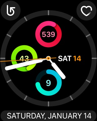
Here's how it works: You have 3 circles: red, green, and blue. The red circle tracks the calories you've burned over the course of the day. The green tracks how many minutes you've moved/exercised for. The blue tracks how many hours in the day in which you've stood up and moved around *at least once*. There are goals set for each circle - the calorie goal is set to 500 by default (but is variable), while the exercise and stand goals are set for 30 and 12, respectively. If you haven't stood up in the last hour, at the 50 minute mark, it'll give you a little tap on your wrist and remind you to stand up and move around a little. It sounds kind of silly, but it's a really effective psychological reward mechanism.
Finally, there's a program called "Breathe". This is a really simple little app that guides you through a deep breathing exercise. It uses the sensor to figure out when you're a little stressed (or in my case, drinking coffee) and offers to guide you through a deep breathing exercise to cool down. I was skeptical of this too, but I've found I feel a lot better when I do this – even for just a minute – once a day.
2. Notifications – And the Sweet Sound of Silence
Next up: the notifications on the watch. Personally, I’ve permanently switched my phone to silent mode, because the tap on the wrist that the Apple Watch gives you when you receive notifications is both more noticeable and less disruptive than traditional phone notification noises. Further, it lets you more efficiently ignore the unimportant notifications you receive – newsletters, facebook comments, unimportant texts – which is ultimately really nice. Of course, since the time is also on the watch (duh), I’ve ultimately wound up looking at my phone much less. For the little things you look at your phone for – the time, the weather, music skipping/volume, notifications, timers – the Apple watch steps up and fills the role more conveniently and with more subtlety.
3. Ping or Mute your Phone
How often do you misplace your phone right next to you, but aren’t sure where it is? Or go somewhere where you probably should turn on Do Not Disturb mode, but meh it’s on vibrate and it’ll probably be fine. The watch has quick buttons to do both of these things for you. You can instantly turn Do Not Disturb on or off, and instantly make your iPhone make a noise (or if you hold it down, flash the LED too) to help you find it. Honestly, this is one of the smartest things they did.
Ending the Rule of Three
Of course there are lots of other cool things to do, including: auto-unlocking your mac, being a stopwatch/nightstand-alarm-clock/timer, showing your daily calendar, being a remote for your camera, and more – but this post is already pretty long and I don’t want to bore you too much.
Complaints and Grievances
Of course, it wouldn’t be a fair review if I didn’t list some negatives.
1. The Screen is Small
I knew this going in, but ultimately, there are simply limits on what you can do with an interface on a 1.6” (or 1.5”) screen. While I think Apple and third party vendors have, for the most part, created good interfaces given the screen size, it ultimately always falls a little short. Force touch, the first time I used it, was a disappointment. For those not in the loop, force touch is a feature in Apple’s touch screen products where applying more pressure when selecting an item (i.e. pressing harder) performs a contextual action, usually a menu related to the item you pressed. The second-gen Apple Watches have this feature, but it doesn’t activate based on the item you pressed, it activates based on the app or screen that is open. This essentially makes force touch a “third button” rather than adding a third dimension to the touch screen and, while it makes sense for a screen this small, is disappointing.
2. No Third-Party Watch Faces

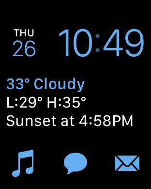
One of the nice things, and something Apple put a good deal of effort into, was the watch faces. This is what you look at when you open your watch. Don't get me wrong, the customization is not disappointing and the offerings are fairly good, but I believe that third-party faces could add a lot of utility to the product. Attached is the main face I use; it has buttons – called "complications" – to display extra information besides the time. The complications come in multiple sizes, and third-party apps can be allowed to use them. However, the watch faces are all created and controlled by Apple, which throttles this customizability.
3. The App Screen

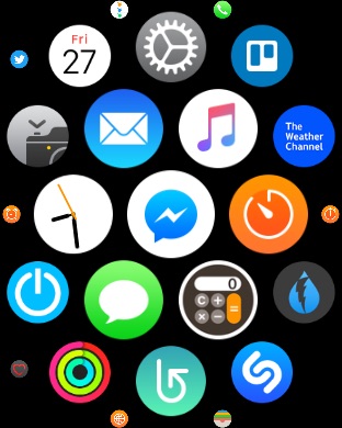
The app screen is arranged hexagonally. The rationale behind this is understandable; it makes more sense when looking at this kind of screen than the traditional rectangular grid. That said, working with this screen is awful. I personally set up my watch faces such that I can avoid this screen as much as possible. It's harder to navigate, remember where apps are, and see apps. If I'm looking for a specific app, I'll often miss it once or twice while looking for it. Further, it's terrible to organize; unlike when moving apps on an iPhone, the direction that apps are displaced when one moves them is unpredictable. This makes organizing the app screen a pain, which of course makes it even harder to use.
Closing
Overall, the Apple Watch is very thoughtfully designed, offers a lovely user experience, and integrates easily into one’s daily routine. Being able to swap out watch bands is easy and cheap, so it can be dressed for any occasion.
Should I buy it?
…Probably not. While it’s certainly very cool (and useful), the starting price of $269 is, in my opinion, a bit steep. Despite this, if you have money to burn and want a cool, handy gadget this may be for you. It also makes an excellent and thoughtful gift.
It should be noted that Apple offers discounts through its refurbished store, where prices start at $229. In my experience (this was typed on a refurbished Apple computer), their refurbishing program is just as good as brand new.